Welcome to NexusFi: the best trading community on the planet, with over 200,000 members Sign Up Now for Free
Genuine reviews from real traders, not fake reviews from stealth vendors
Quality education from leading professional traders
We are a friendly, helpful, and positive community
We do not tolerate rude behavior, trolling, or vendors advertising in posts
We are here to help, just let us know what you need
You'll need to register in order to view the content of the threads and start contributing to our community. It's free for basic access, or support us by becoming an Elite Member -- discounts are available after registering.
-- Big Mike, Site Administrator
(If you already have an account, login at the top of the page)
What I noticed the biggest difference with was the actual bar color, like you said. I work on AutoCAD all day, so I am very used to and comfortable with a black background. However, I never though about how much weight I put on colors. Just like in my work, colors have specific meanings. Never realized how much weight I put on green vs red (or any other color) even if price was flat. 3 30-minute green bars in a row, even if price has only netted 5 ticks, and I am subconsciously wanting to buy. I will have to play around with mono-chromatic OHLC bars and find a color that eliminates that feeling (probably some shade of grey)
Background always black when possible, easier on the eyes.
I prefer single color bars, usually green. Have no idea why but I fell I can read the chart better and I like the effect the green has on the black background.
Single color bars because is the only way I'm not influenced by the close of it.
I've been testing with HL bars but I miss the close right tick on the last bar since it tells me where the last price is. I have an indicator that plots a line but it's something that is still being studied.
I gave up candlesticks many years ago because I tended to read the candle pattern and that would generate conflicting readings with other studies I was using back then. So I moved to regular bar.
Color does have the ability to call the eye and the brain attention but also velocity.
Last week I was testing a T&S code on MC and had it near the DOM and all of a sudden a sea of read numbers populated the window an I found curious the reaction I had. I immediately thought on strong selling but when I looked there was only one's printed, just singles have been traded. My reaction was not only because of the "rediness" of the numbers but also at the speed that happened. The two combined means trouble for me. I need to take some time to study this behavior.
Profiles I like to see them as shades of blue. The one MC has as default is amazing. Dark orange profiles are also appealing to me.
Strangely enough the red on footprint chart and sometimes the velocity fast move takes does not affect me. I find this odd.
It's interesting to study this stuff. How simple things such as colors and how fast numbers rollover generate such reaction on us.
If I become half a percent smarter each year, I'll be a genius by the time I die
Kind of thinking the same. For that reason I have toned down my charts a lot using a black background and hollow bars with toned down red and green:
I will experiment with grey candles tomorrow I guess, although I will use different greys for up and down as I want to see at a glimpse if it's an up or down candle.
White backgrounds always hurt my eyes. And colors on black background get much more intense, so even a semi bright color burns holes into my retina and a standard red candle would probably scare the sh!t out of me
Fast moving charts actually have the opposite effect on me than a fast moving tape (kinda weird). If I'm watching the tape and it explodes in one direction, I tend to wanna chase it. If I'm watching a chart and it explodes, I think that the move "can't last long". This is even if it is moving in my favor, which can cause me to close winners early and hold losers too long. I agree that this is a very interesting subject.
Edit: It would be interesting to code something that locks a chart and only shows a snapshot every N-seconds. Wonder if anyone would be willing to trade with it
above link.........interesting to say the least.. Video demonstrates how your mind will be fooled with how it perceives colors
I used to be a huge fan of black backgrounds and sharpe colors but have moved away from that to allow my mind to comprehend whats on my chart rather than react to color changes.
Red and green never made sense to me, blue is sky and green is the grass
I think the bars colours on here are close enough to each other to not have an overly large psychological impact and at the same time still relatively well distinguishable between up and down...
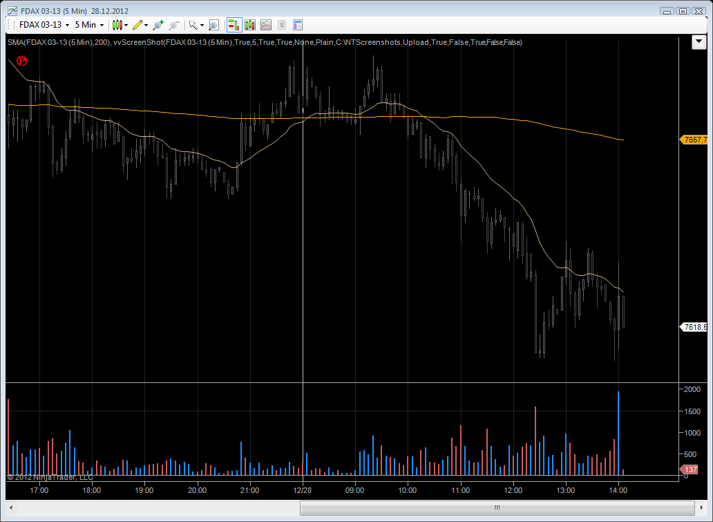
What do you guys think? Remember that I have the toolbar and the complete border and titlebar hidden on my trading workspace, so there would not be this hard contrast you can see on the screenshot...
I prefer the dim grey background because it is the easiest of any color on my eyes. I've tried black, but it gives too much contrast to the candles. Red and light green bars are most familiar to me so they are least distracting. I also like red and green candles because they remind me of playing pool or poker at an old fashion bar with windows constructed of diamond shaped red and green panes. Same-color bars confuse me at times because I can't tell at a glance where the bar started or ended. I find that every time I add an exotic color combination I inevitably go back, a week or two later, to the dim grey, red, and light green theme. I'm not sure what it is, I just gravitate towards these classics. The key for me is to have the least distracting combination so I can gaze at the chart longer and pay more attention to what price action is doing.
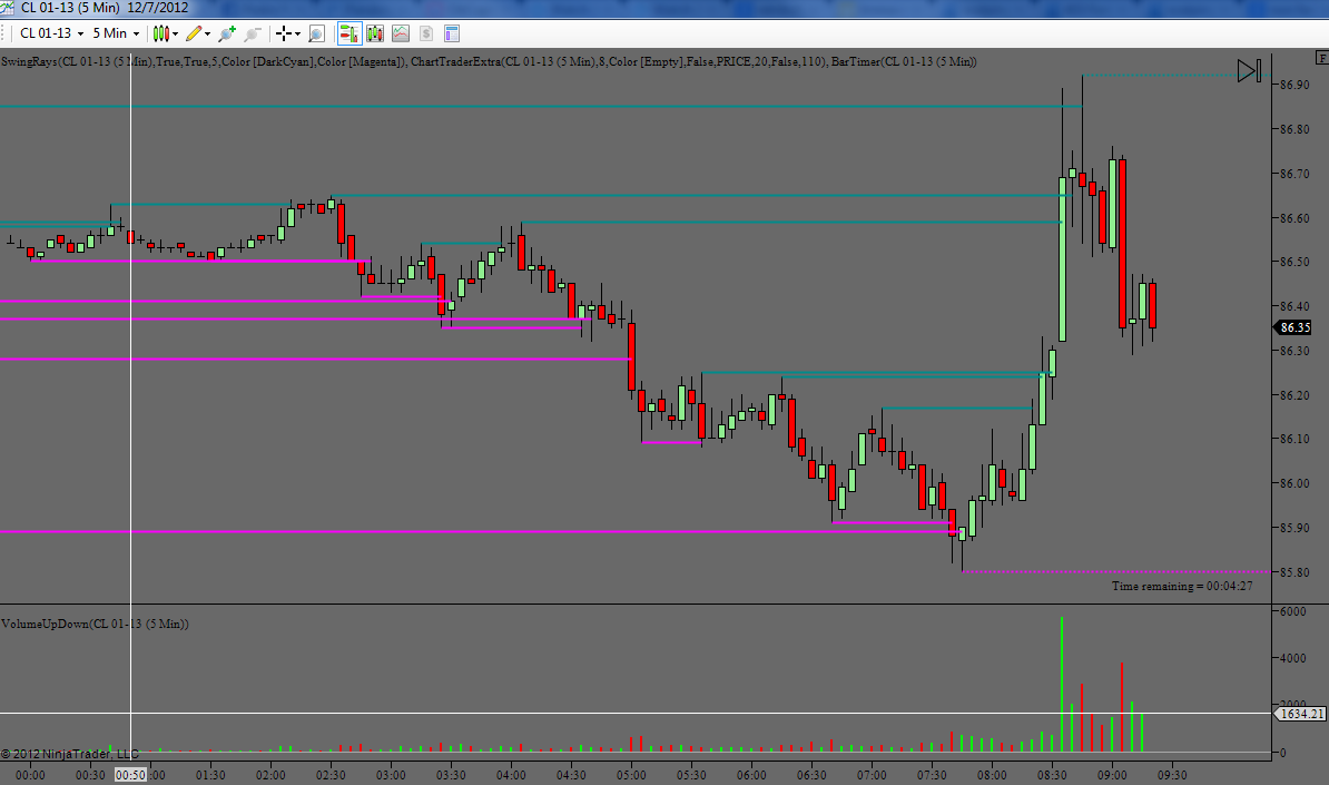
(The dark cyan and magenta swing rays I've just left their default color because they don't bother me. I suppose the color scheme with this indicator doesn't exactly mesh with the candles, but for some reason it has just worked for the past few months. I prefer they're not red and green like my bars because I don't want them to have the same psychological connotation.).
R.I.P. Joseph Bach (Itchymoku), 1987-2018.
Please visit this thread for more information.


 for me. I need to take some time to study this behavior.
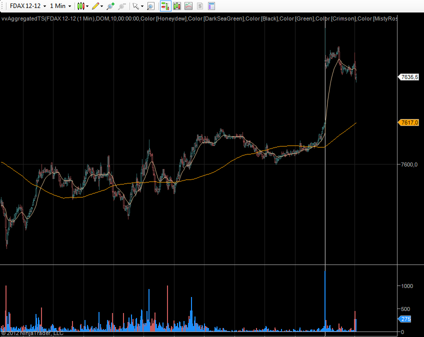


 dont believe anything you hear and only half of what you see