Welcome to NexusFi: the best trading community on the planet, with over 150,000 members Sign Up Now for Free
Genuine reviews from real traders, not fake reviews from stealth vendors
Quality education from leading professional traders
We are a friendly, helpful, and positive community
We do not tolerate rude behavior, trolling, or vendors advertising in posts
We are here to help, just let us know what you need
You'll need to register in order to view the content of the threads and start contributing to our community. It's free for basic access, or support us by becoming an Elite Member -- see if you qualify for a discount below.
-- Big Mike, Site Administrator
(If you already have an account, login at the top of the page)
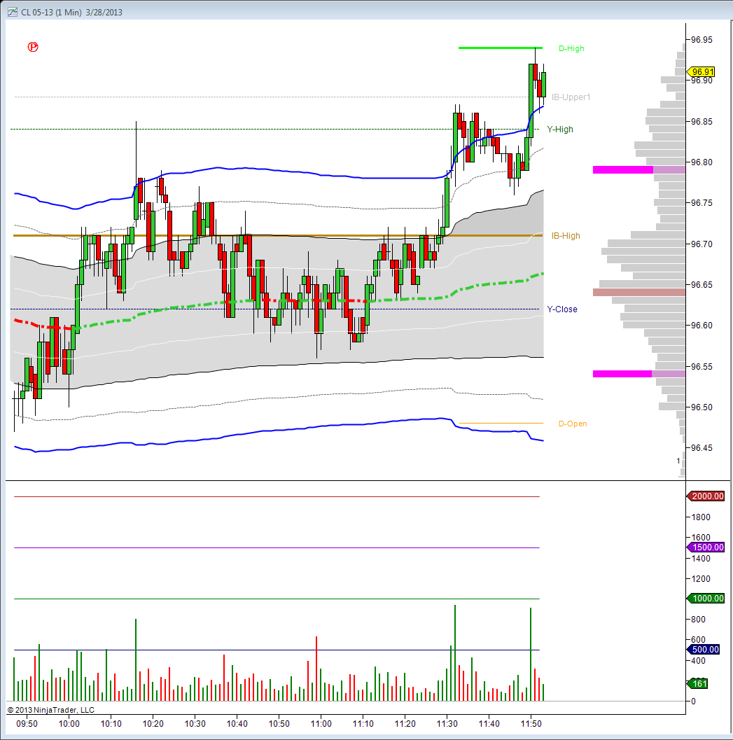
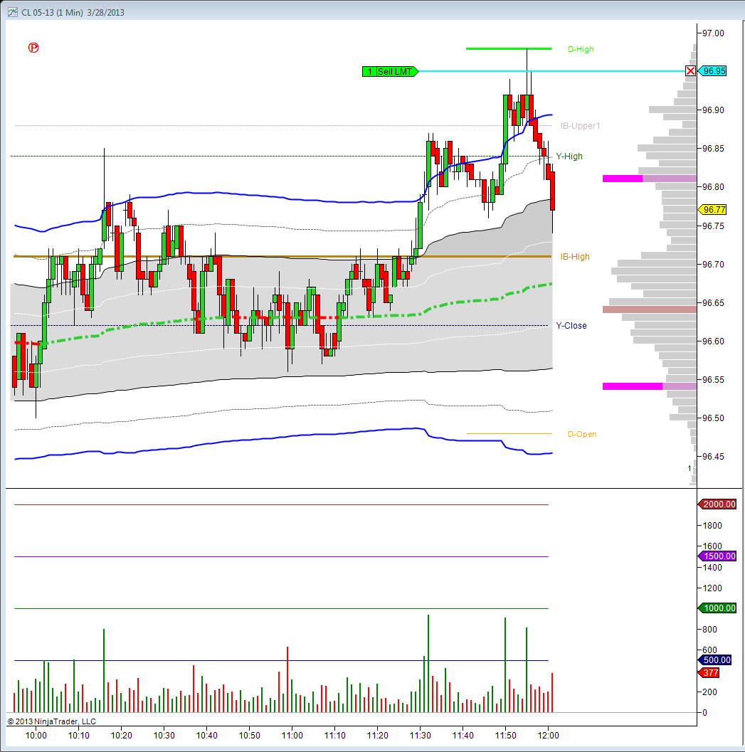
Finished down today, after holding a trade to a decent profit and then allowing to come back to breakeven. But I am going to continue to work with this concept. I did some more review today, saw where I am not understanding a few more things, made some chart changes to make me focus only on what I am trying to focus on... May go to sim. If I get to where I give back what I gained since I started back, that will be the trigger.
I edited the indicator to change the numbers to black, and then watched a video by @Private Banker to see if his color settings are easier on me than @greenr's. (I noticed white screens are less likely to give me headaches after long periods.)
I did not really notice this until after I made my own version, even though it seems ridiculously obvious, that his color scheme reduces colors to only one; red.
Broker: Advantage, Trading Technologies, OptionsCity, IQ Feed
Trading: CL, NG
Posts: 1,038 since Jul 2010
Thanks Given: 1,713
Thanks Received: 3,863
You got it right there. I changed my color scheme to provide clarity obviously but also use colors that aren't stressful if that makes any sense. Trading can be stressful enough, lol! I'll admit I'm a bit artsy with everything in my life and really like clean modern looking things. This is my interpretation of what I like on to my charts.
I used to stare at black screens all day and it just destroyed my vision and then one day, I just decided I didn't have to deal with that anymore and changed everything to how it is currently. It makes a big difference in my opinion.
I started with black backgrounds believing they were easier on my eyes, but now have experienced that they really they are harder on me.
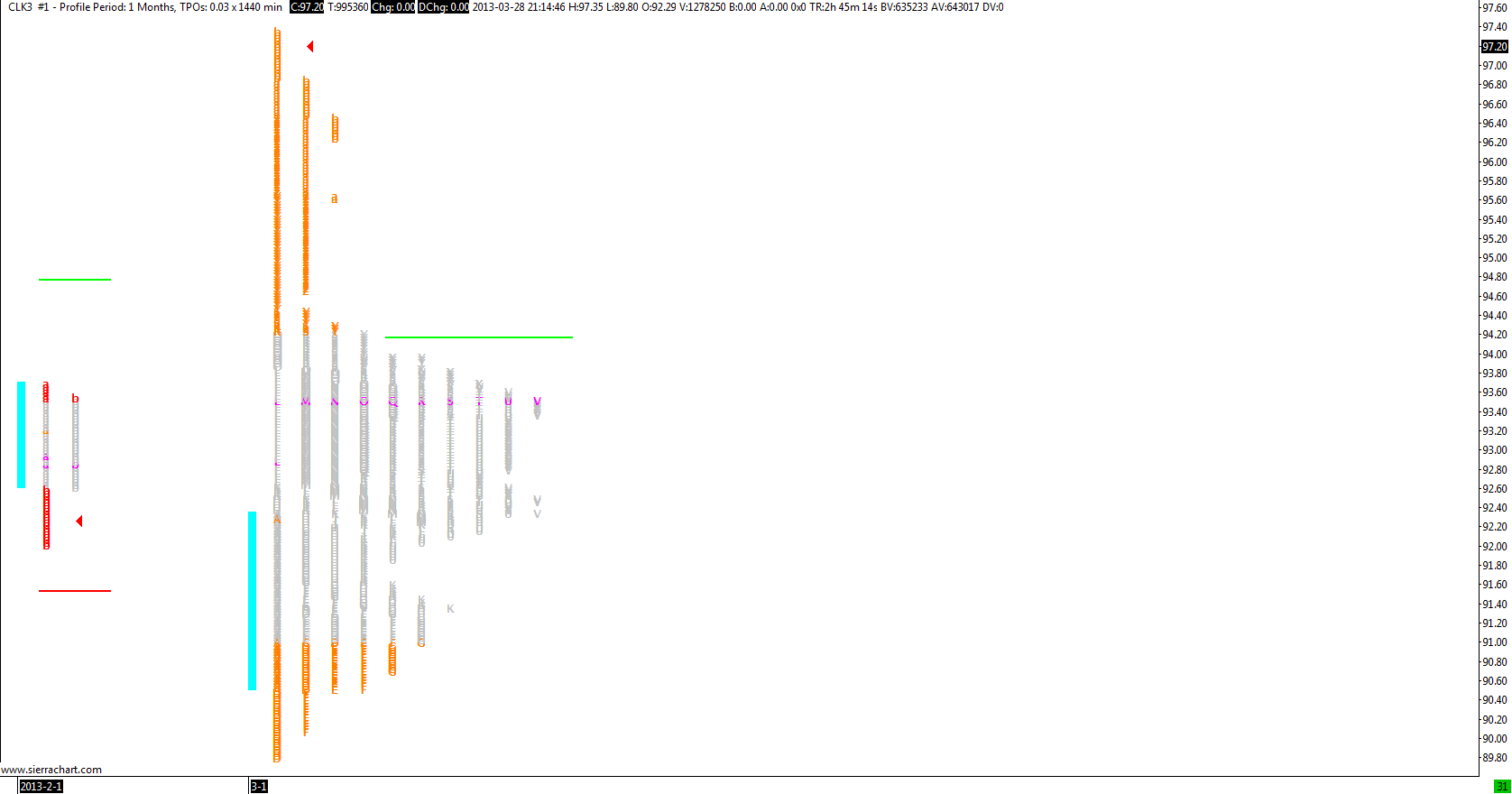
I was on a mission to understand a volume ladder.
After I had your colors on MY charts (sounds like it would not be different), it took a different meaning. Simplicity. I have now recreated most of your charts since I did that, looked through them at what they do, how they might work together, saved as templates. This is my favorite so far:
They feel weird, and my guess is I will eventually shape them some, but I am questioning and rebuilding a lot of things so discomfort is expected. They are extremely uncluttered to me when trying to see "value", although I am not sure what I am doing with that yet... lol!
Still working through Jim Dalton material, fell asleep with my laptop last night.
I have on several occasions in the last couple of years tried to work with black backgrounds, because they look "cool" when I see others' charts. But they always look so different on my own screen. I have given them an honest try and concluded that the eye strain is just too much. I had success with an RGB of 50,50,50 to tone down the blackness, which was quite nice, but a 252,252,252 background with normal colors and black text is just so easy on the eyes. For those who turn from a black to a white/neutral background, at first it seems like it's way too bright, just like walking out of Plato's cave and into the sun would give one a temporary blindness because it's too bright, but that's just because of the contrast.