Welcome to NexusFi: the best trading community on the planet, with over 150,000 members Sign Up Now for Free
Genuine reviews from real traders, not fake reviews from stealth vendors
Quality education from leading professional traders
We are a friendly, helpful, and positive community
We do not tolerate rude behavior, trolling, or vendors advertising in posts
We are here to help, just let us know what you need
You'll need to register in order to view the content of the threads and start contributing to our community. It's free for basic access, or support us by becoming an Elite Member -- see if you qualify for a discount below.
-- Big Mike, Site Administrator
(If you already have an account, login at the top of the page)
Hello
I�m trying to do this for some time without success.
I need to display the implied volatility oscillator with candles instead of line, is it possible to do such thing?
Thanks
Mibobwa, not sure how that would be possible, since OHLC values (on a Daily chart) are by definition "intraday" values and since ImpVol by definition excludes intraday values and timeframes shorter than 1 day. Well, maybe somebody else knows how. But would you be satisfied with a histogram? And you could also load this with the canned ImpVol study into one panel and see both. (to merge, click the little up/down triangle that appears when you hover over a loaded study on your Edit Studies panel)
I recently found a code for smoothed heiken ashi bars, however for some reason all the bars are red (down trend). I'm pretty sure I should be putting some if else statements at the end there. Any ideas?? Thanks!
Source Code:
input period …
. So you "might" get away with the Add Chart function if it still works. Alternatively, code might be written for WEEKLY "sort of" candles, where you could REFERENCE impvolatility() as Highest(high,5), Lowest(low,5), Open[5], and Close. Then plot it, and assign specific colors and/or shapes (dots, triangles etc) to each datapoint.
Thanks tangerine for your suggestions, I think it's difficult to build daily implied volatility candles oscillator as there are no intraday data, but it is possible to build weekly one with the daily data as you suggested, I will try this.
though I program in other languages, this is the first time with thinkscript, I did write the code below but I think there is something missing, help appreciated.
Mibobwa, the first "error" I see is you didn't code Close as I suggested. Instead, you called for Close[5] (let's call that Monday Close, for example), but what you want is Friday Close, i.e., the Close for the week. Of course, this is a moving calculation so the days are just examples. Other than that, you're calling for what may be an extinct piece of TS code, i.e., "growColor", which I believe is what they were saying at that link- that it doesn't work anymore.
One other thing... I am shocked at how you got away with writing that code that way. I never knew a standalone def could be written without popping up code red (and I write tutorials on TS basics ) . Anyway, I think you're working too hard- the simpler version of your code is this, but it still does not display anything:
Alright, I'm gonna try and build what I mentioned earlier with dots and triangles, etc. Be back later.
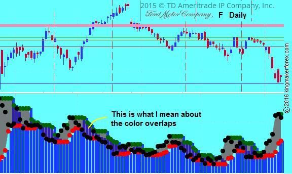
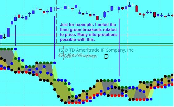
Okay, Mibobwa, here's the best I can come up with. I also added a Cloud line which you can delete. You can change dots to triangles or whatever with right-click on the study, then Edit Study. Also, I found that it makes viewing easier if on the Edit Study panel I clcik Draw As and choose the third one in the dropdown (looks like a battleship to me). If you do that you get this nice overlap of color that seems to signal start or end of a trend. As we discussed, this code works for Daily or higher. If you run for Daily, it's showing ImpVol for the past week; if you run on a Weekly chart, it's showing you ImpVol for the past 5 weeks (so we could code an Input to change the period from the charting screen if you want).
Dot colors: Blue is Open, Dark_Green is High, Red is Low, Black is close.
EDIT~~ Hm, I don't understand this but once in awhile the Open plots lower than the Low. No biggie, it's usually correct.
Mibobwa, instead of adding the battleship thing, just add an extra line of cloud code: AddCloud(myopenVL,mycloseVL, Color.lime, Color.yellow);
The effect is stunning and informative- thanks for the idea of this code!
As far as I know, Mibobwa, at present there's no way to plot candles on a lower study. But I did just try something interesting- I removed "declare lower;" to make this into an overlay on price (then right-click on the study and Use Left Axis, and then from the chart screen I went in and unchecked all 4 plots to get rid of the confusing dots. Makes it easier to compare the clouds to price.


 ) . Anyway, I think you're working too hard- the simpler version of your code is this, but it still does not display anything: