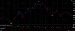
To do this the indicator looks at consecutive red/green bars (and allows a specified number in the other direction without switching) to calculate the size of each bulge and runs some stats. It calculates a running threshold and treats that as 100%. If a bulge in excess of 100% is spotted it marks the bulge yellow dots and at the end prints its percentage size on the main chart area.
In the end I found it more useful to mark the bulge sizes relative to the previous ones on the same side (buy/sell). Magenta means the bulge is greater than the previous two and white means less than previous two. Watch for sequences of Magenta - Red/Green and then White. This can mean a move is over and ready to turn.
The indicator does colour bars according to some fuzzy bias logic. Basis for this is when bulge sizing switches from one side to the other and this can be seen when a white cross marks a bulge. The magenta bar simply says that a magenta bulge is in progress. Frankly I never found it that useful. In the end I preferred the bias colouring of my CDCycleMTF indicator mentioned in the Delta thread (although I still monitor this bias under the bonnet of my VacuumBar indicator).
As always you need Tick Replay and Math.Net.
Enjoy
Category The Elite Circle
|
|
|
