Welcome to NexusFi: the best trading community on the planet, with over 150,000 members Sign Up Now for Free
Genuine reviews from real traders, not fake reviews from stealth vendors
Quality education from leading professional traders
We are a friendly, helpful, and positive community
We do not tolerate rude behavior, trolling, or vendors advertising in posts
We are here to help, just let us know what you need
You'll need to register in order to view the content of the threads and start contributing to our community. It's free for basic access, or support us by becoming an Elite Member -- see if you qualify for a discount below.
-- Big Mike, Site Administrator
(If you already have an account, login at the top of the page)
I use it a lot. But sometimes when using it on a very long thread (like the "want your ninja indicator created free", "gomi" threads) it becomes overwhelming because there is no categories so we have to search page by page.
IPS is delaying the release of IPB 4.1 for a couple more weeks. I'm looking at adding another developer to the project to help speed up our conversion process.
I was hoping to be further along, but you know how it goes. Right now focus is turning towards themes.
Guys, I need your input. If you have another forum of any kind (any topic) and any platform (vbulletin, xf, ipb, whatever) and you like the way it looks visually, its colors, its design, layout, etc, please post it below.
I'm not asking about features or functionality. I'm asking solely for visual theme design choices that you like. This is important, I want to get some of your feedback and incorporate it into my own.
With the new design, we first need to establish what elements to capture. Each webinar has these key elements:
- Title of webinar
- Description
- Date and Time
- Author(s) and/or Vendor(s) presenting
- Thumbnail image
- Keywords/categories
- Discussion thread URL
- Presenter URL(s)
We will also capture things like likes and views. We will be using our own internal HTML5 video player and not using YouTube, so we can control access to Elite content better.
The idea is to display all this data in a better format than we do currently. And to make the list sortable in several ways, including:
- Sort by date
- Sort by author
- Sort by keywords/categories
And in addition to being sortable, it also needs to be searchable. This way you can search within the webinar archive by:
- Search by author
- Search by keywords/categories
- Search by match in description
- Search by match in title
Our list is currently formatted like so:
I'm currently thinking that the format is somewhat similar, but that each webinar 'block' will contain the information I mentioned above. The long description would be truncated, but expandable with a click. Instead of 4 thumbnails wide, we may get only 1 or 2.
Have I missed anything important? Is there some sort of sort or search option that you guys need that I've not considered?
Please let me know, because I am finalizing the requirements and sending them to the developer this weekend.
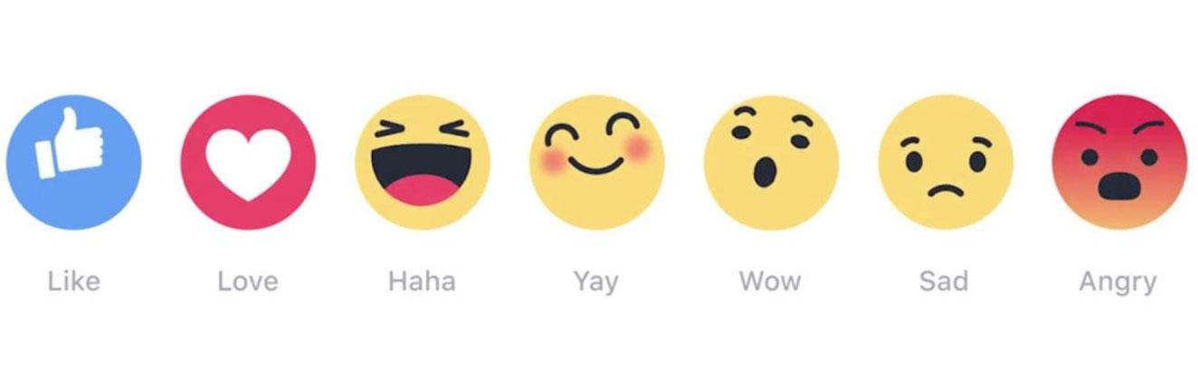
I don't always have much of an opinion either way on things that are more appearance, but I must say that I am alarmed by the Sad and Angry, and not too thrilled with most of the rest.
1. I think that clicking either Sad or, especially, Angry, as a response to a post, is really an encouragement to bad beahviour, as in following up with an angry or sad response post against the poster who you just slammed. It also could easily lead to flame wars, as people who felt insulted replied in kind. I think the potential for these is close to horrifying. (They are sort of "Don't Like" or "You Suck" icons. )
2. The rest are kind of over-cutesy, at least to me. Not alarming, just slightly dumb. (Sorry, but that's how they look to me.) I guess that I would say that if we are looking for professionalism, these don't spell that to me.
3. I was one of the ones who didn't weigh in in favor of "Like" to replace "Thanks." They do mean something different, in some cases anyway. However, I could live with Like, since the essential meaning is that you are positive about the post. I still prefer Thanks, but no big deal.
4. Having many variations on approving the post, such as Love, HaHa, Yay and Wow, aren't absolutely terrible, but I don't see that much point. Also, I think that the names, and certainly the icons, are not that professional either. Those particular icons look cartoonish, in fact.
5. Less is more. Simple is better.
All that said, I suppose that if Facebook adopts them, they will at least become widely recognized, and perhaps not seem so dumb as I currently think them.
On the other hand, I don't have a Facebook account and it is likely that many other people in the futures game don't either, which is the professionalism issue again. In the same line of thinking, Facebook doesn't spell "serious" or "business" to me. (It may be getting that way. That's not something I'm up on that well.)
If this were being proposed in a business context, which I guess it is, I would have the question of whether you want a business look or a fun look. (And if "fun," how grown-up do you want your fun to look?)
Kind of a negative response from me altogether, and I do realize that some of it may just be me being stuffy about change. Oh, well.
Just showing what Facebook is doing -- those aren't mine. I want to avoid negative responses as well, but just like on Facebook, a lot of members here want to express dislike/disagreement over a post. Looking for best way to handle.


 )
)