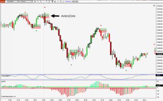
I always wanted a better way to visualize what the stochastic indicator was telling me, so I built it myself. As you can see in the screenshot, the StochMaster generates an ActionZone seen as the red and green rectangles. Since nobody knows what price will do as it exits the Zone in either direction, I color-coded the upper and lower regions. Watch how price respects the median line of the Zone. It's quite impressive, right? Then, let your eye extend the Zone (as in the upper left where two high Zones have formed), and you'll notice that Zones have staying power and are areas to be respected later on. The green and red dots are where price left the overbought or oversold regions in the subpanel. As usual, everything is adjustable in the Properties. There is also an RSI component to help filter the signals. The 'Flatness' property is used to describe the slope of the RSI. When the RSI is flat, StochMaster signals are reduced. The value can range range from .1 to 100, but I usually keep it set at 3. Experiment with it and find out what setting works best with each instrument and period.
The chart also has my dpDPO on it. The ADX component of it is the thick black border of some of the candles. It tells you where strength is.
If you run into any issues with this, please let me know. If you think this is pretty cool, please let others know by leaving a great comment.
Thanks,
Dave P.
Category NinjaTrader 8 Indicators and More
|
|
|