Welcome to NexusFi: the best trading community on the planet, with over 200,000 members Sign Up Now for Free
Genuine reviews from real traders, not fake reviews from stealth vendors
Quality education from leading professional traders
We are a friendly, helpful, and positive community
We do not tolerate rude behavior, trolling, or vendors advertising in posts
We are here to help, just let us know what you need
You'll need to register in order to view the content of the threads and start contributing to our community. It's free for basic access, or support us by becoming an Elite Member -- discounts are available after registering.
-- Big Mike, Site Administrator
(If you already have an account, login at the top of the page)
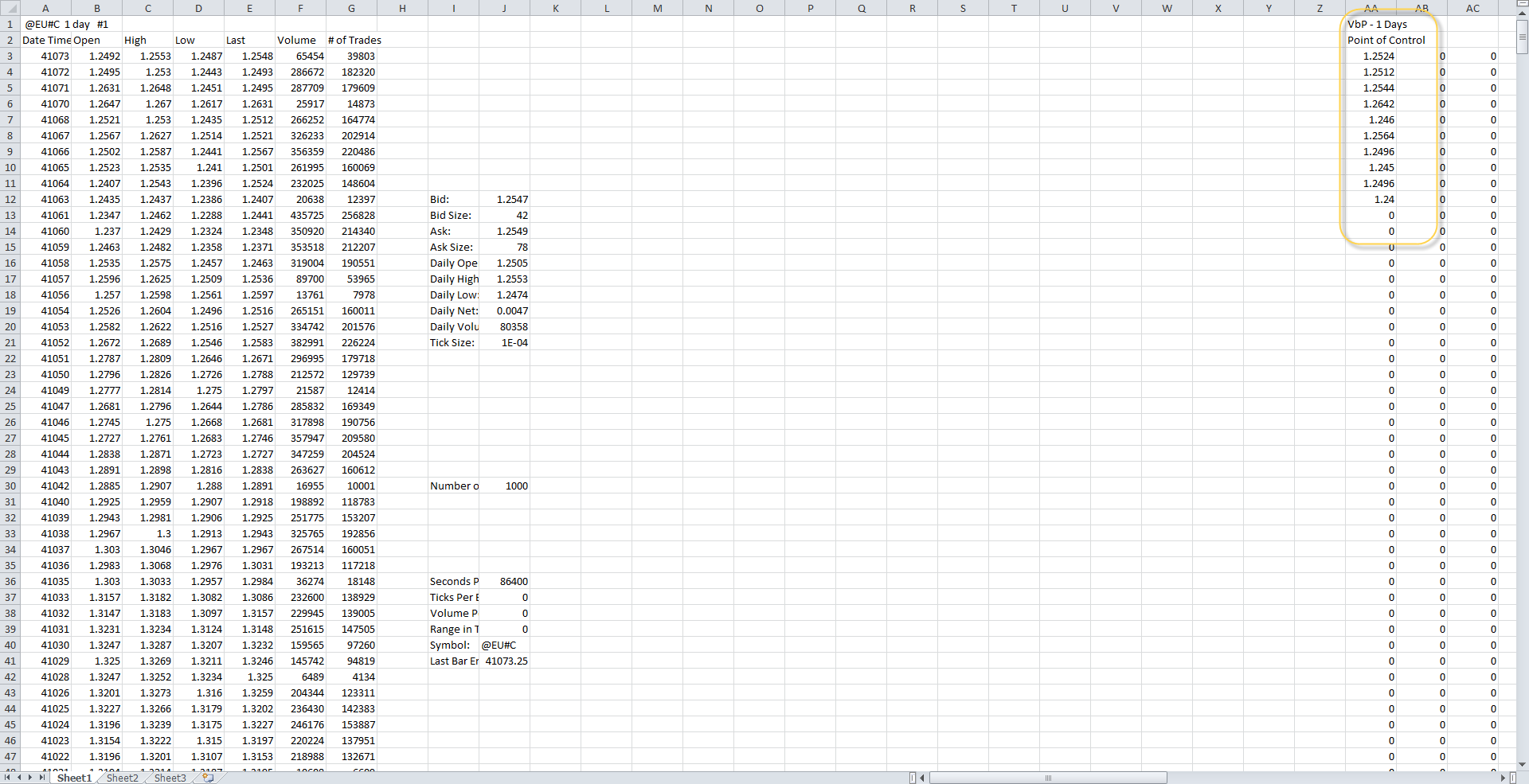
The Volume Profile study already plots the POC, but it does not plot the Value Areas. It also appears to only plot the 10 most recent POC entries, no idea why only 10. Here is a screenshot of the spreadsheet data.
I had this problem with Volume by Price and was advised to add the study "Volume Value Area Lines", which gives me the data I need in the spreadsheet, ie VAH/L and POC.
I also tested the study "TPO Value Area Lines" and it works in similar fashion.
I am aware that this is slightly off-topic, but have you found a way (other than copy-paste of all cells) to export the content of a SC spreadsheet to Excel or another software?
Actually, my final objective was to import all SC chart information values (price and indicators time series) to R.
The most convenient way that I found to do it is the following.
1) In SC, Prepare a chart with relevant indicators
2) Add Spreadsheet study
3) In the spreadsheet, select all cells (top-left cell) and copy (Ctrl-C)
4) In R, import the clipboard, and process it.
For instance, the following chart could lead to the below xts object: