Thank you for the comment and question
You can ask most long term traers about my comment and I think they would agree.
It is an accident when one of our stocks takes off like a rocket. We don't go looking for them. But all rockets hit the ground if they don't escape gravity.... So when one of our stocks takes off like Badger Daylighting making 25% in 3 days if we are not vigilant that gain for 3 days could be lost in 3 more days.
I am not really acting as a long term trader on this website. Because I am journaling here and describing what I do I basically look at all of my stocks on a daily
basis....even my real portfolios (of which I also have BAD.TO). Normally I ignore my holdings for most of the week doing a status update (similar to the mid week/ end of week status as I show here) at the close of each week's trading. As a result I could miss such an event if I acted as I normally would have.
I juggle a lot more stocks in the air than the four, I show, here in real life. It is difficult to follow 50 plus watchlists daily and still have a life ... at least the life I want.
The quadrant analysis chart that I have developed came about as a desire to visually see the status of my holdings and watch lists. It only takes 2 minutes to update 20 + stocks this way.
Here is a USA watch list of stocks that are high pennies (above $1 but below $5).... this is only the summary page of 8 of them....the rest of the charts are below.
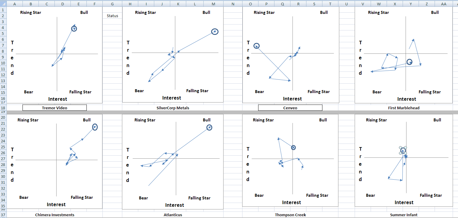
the circles are an indication of where that chart ended on the last update so you can see how the chart has changed since the last time you checked things out. each arrow is not a simple day on day creation.
After 2 minutes of updates I have this entire watchlist updated as I like it. (you can see at the bottom other stocks but I am only showing the summary of 8 of them here.
Now look at SilverCorp Metals.... see it pegging into the BuLL quadrant.
Here is the page devoted to that stock

You can see the basic data from which all these charts are calculated but I have hidden what I do to get them...I am not prepared to discuss that.
The right contains a stripped down version of a trigger chart that I would use in a detailed analysis. From this simple chart I can see that the stock price has been falling for some time and it has bottomed out (red circle) and is on the rise..... if you have followed how I create my trigger chart (and if you haven't I suggest you do it is good reading

) you will know that this could be just a rest....not a bottom but the green circled area shows a rising MACD and Slow Sto which is encouraging.
So on the basis of this I might want to investigate this stock more with a complete analysis.
I intend to make a workbook of Canadian Indices... then I can shorten my searches something like this
quad Workbook of TSX indices => Index A... Index B... Index C ................
......................................................................... |
......................................................................... |
......................................................................... |
........................................................ quad analysis of Index B => Stock A ...Stock B... Stock C......
......................................................................................................................................... |
......................................................................................................................................... |
............................................................................................................................... detailed analysis
I am not set up that way but that is the idea... an alerting system that rapidly homes in on sectors/stocks that interest me on criteria that I have defined
Back at that last chart next to the "trigger chart" I plan to have idiot light alerts based on my TA criteria. I will be able to have exactly what I want...not make do with something someone else dreamed up that is contrary to what I like to do.
to address that last question of yours
I have never applied this quad analysis to intraday trading. I use about 200 daily records when I do this analysis so if you were using 5 mins charts I would require 200-5 min intervals or 1000 mins or 16 hours of h/l/c
vol data. It has to be easily and automatically downloadable using excel and
I do not have access to such a data source.
It is an interesting extension of this idea but I am still working on improving this for daily data.... right now.
Thank you for the interest and reading my journal.


