Welcome to NexusFi: the best trading community on the planet, with over 150,000 members Sign Up Now for Free
Genuine reviews from real traders, not fake reviews from stealth vendors
Quality education from leading professional traders
We are a friendly, helpful, and positive community
We do not tolerate rude behavior, trolling, or vendors advertising in posts
We are here to help, just let us know what you need
You'll need to register in order to view the content of the threads and start contributing to our community. It's free for basic access, or support us by becoming an Elite Member -- see if you qualify for a discount below.
-- Big Mike, Site Administrator
(If you already have an account, login at the top of the page)
I mentioned that the something big is underway with the TSX
The chart below should speak volumes!! - especially when I told you the Canadian market is not allowed to be legally manipulated as the USA market is.
So China needed to raise rates
Trouble with the PIIGS of the Eurozone
No jobs in the USA
ANd NOW
BOTH the TSX and oil have broken down!!
Time for you to make some money David!! As the only student of this course, you know the CL wedge was due to break and it has. Patterns rule!!
---
When a pattern breaks you look for confirmation.
Some people use a certain amount (in CL's case below 95.18 low) and some people use time, wait 2 or 3 days.
Often it will bounce back up into the pattern giving a second chance to sell.
A bounce tomorrow could give a sell at 95.90 (the 1/16 on June) or 95.78 low of 12 May, or 95.55 low of May 17. Watch the action tomorrow. I'm expecting a bounce up at 9am CT when the Philadelphia Fed report comes out. Wait for it to raise and fail.
More cautious investors could wait til after Friday's close.
We started with the very long term and now we telescope in, zooming into the last 5 yrs.
First notice the high slightly above 15,000 in mid 2008.
Then we have a drop to about 7,400 in early 2009.
So about -7,600 in 8-8months.
Next is a rise slower than the drop in a curve that goes up to about 12,200 (about April 2010) and drops back to about 11,050 (about end of may 2010). This is wave1 (I speak of waves in terms of an up and down move to complete a wave, which for 'elliots' is 2 waves).
Joining the low of early 09 to mid 2010 are the 2 points on which the red trend line is drawn. This line touches again about 1 and 1/2 months later and then its extension is cut about May this year, around the 13,300 level.
So now we have the second wave.
The 15,000 level marks a double top that is separate by almost exactly 5 years. (We haven't spoken of timing but 10yrs, and 1/2 of that 5 years are very important.) Right from the start of the the 'recovery' of money/debt-printing, the key question was is this a recovery or a bear market bounce.
For a recovery we would have had 3 segments (waves) with the last pushing through the double-top at 15,100 . That is why only two segments and not a third is so vital to answering this question. Now we could have had a third segment (wave) and as this second wave is forming we are watching like a hawk to see where it stops.
If it had stopped at the upward sloping trendline of 2009 AND because 14,100 is > 5 eights (or for Fib lovers 0.618) and greater than 3/4 (or for Fib lovers 0.76), odds were it should go the whole distance to 15,100. AND getting above 15,100 is breaking a double top separated by a key 5 year time frame.
The TSX has broken down below the brown line (13,200 area) and tried to move back up into the formation but could only touch the lower edge. This is common that the security moves back up to the bottom edge (in this case shown by a broken triple low) and then runs out of steam and starts its downmove in earnest. As the TSX does not have the pump priming of the SPX you get a clearer picture of what is happening (- and most likely what will follow for the SPX though it can be quite a while later)
Now we zoom into the last 12 months, we find the trendline broken and the last support broken.
We measure the length of the last move and see how far it would be to the support (12,400).
Breaking down below 12,800 a again - which looks like it should in the next few days, gives us a 400 point drop as an initial target.
Remember you are looking for HIGHS for support - not lows.
I have included an example of estimating by showing the measurement from support (link a neckline in a head an shoulders) to the low and shown that this worked out very closely. Subtract the 658 form the 13,430 to get the estimate = 12,722. Actual =12,763 (dif 41pts -nothing really.)
For data see:
http://finance.yahoo.com/q/hp?s=^GSPTSE&a=0&b=3&c=2000&d=5&e=24&f=2011&g=d&z=66&y=0
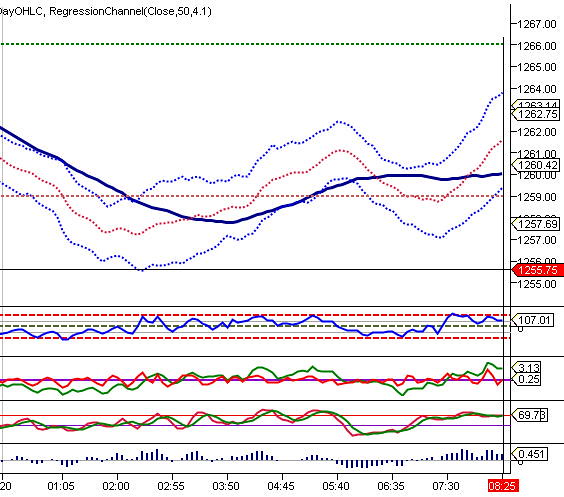
Lesson 5 - Trendlines on indicators
Using a 60 min chart we draw trendlines upon indicators and then look to price action for a connection.
Price based indicators usually lagging price action as they are computed on price action. However, the have the benefit of looking at price action from another perspective and can sometimes highlight changes of price trend for us.
price.jpg
We can draw trendlines upon indicators with the same procedure as price:
For downtrendlines start at the peak (P) and connect to the next lower high (1), draw your line and extend. When a subsequent lower high (2) has formed, connect points (1) to (2) and extend. keep repeating the procedure as long as you have lower highs and lower lows.
(For uptrend vice-versa).
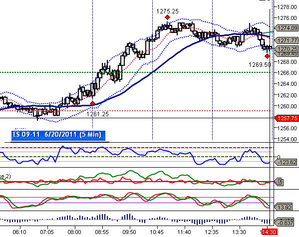
Here I show a 60 min chart of the ES that has several indicators below it.
less.jpg
I have shown this without knowing what I might find to let you see how the process of discovery (or not) plays out. I started at the bottom where the Stocastic indicator (STO) is.
lesa.jpg
As I have copied the chart into my spreadsheet to draw on I can't see the price action - it is "upstairs". This is what I what as I don't want to back fit what happened (ie price action) onto my indicator review.
In the first box we are looking at the STO. I drew a rectangle around a basing area - so a potential buy area. By using the rectangle within the spreadsheet I can extend the vertical lines upward to look at the next indicator "upstairs" within the same time area (the red rectangle).
sat1.jpg
I draw my trendlines on the next indicator - in this case I have shown the momentum indicator (MOM). Then I look at the price action to see "what really happened". From this procedure you can discover new relationship to help you predict price movement.
Sat1B.jpg
Here are the lines on the MOM:
Line 1 is drawn from the peak at about 22.0 connecting the lower highs of 19, 16 and extended.
Line 2 (red box 2) starts the last touch on line one (black box 1) and connects to the next lower high (black box 2) and is extended.
lesb.jpg
Line 3 is drawn along the MOM as it falls off dramatically.
line3.jpg
Conclusions:
1. When the MOM steepens dramatically the price low is approaching.
2. When the MOM forms a low the price low will be in the next hour or so.
conclus.jpg
You would redo this with shorter timeframes once you got close to the end of the steep line 3 (say 15 min chart).