Welcome to NexusFi: the best trading community on the planet, with over 150,000 members Sign Up Now for Free
Genuine reviews from real traders, not fake reviews from stealth vendors
Quality education from leading professional traders
We are a friendly, helpful, and positive community
We do not tolerate rude behavior, trolling, or vendors advertising in posts
We are here to help, just let us know what you need
You'll need to register in order to view the content of the threads and start contributing to our community. It's free for basic access, or support us by becoming an Elite Member -- see if you qualify for a discount below.
-- Big Mike, Site Administrator
(If you already have an account, login at the top of the page)
Time based chart
Volume chart
Tick chart
Range bar chart
I'd like to see a discussion on what single chart you would call your most important or crucial, and of course the big question -- why.
Please post the chart screenshot and tell us why you chose this chart and why it's the most important. Is it a time chart, range/renko, profile, order flow, tick chart -- what & why.
I personally voted for time based and context. Using simple indicators that show me things like daily and weekly ranges help give me some context for what good entry or exit points may be. I keep it simple.
I voted for Renko/Range/Tick. Being a price action trader, I use tick charts as it compliment my style of trading, very well. Considering that each candle on a tick chart represents a number of transactions, it adds a little more depth to a traditional time based chart. Seems to smooth things out in general but also when the market is volatile as well.
My thought is that indicators, bars, charts, etc... all are after the fact - they all illustrate what price just did.
The question I ask is why did price do that?
The reason price moves is because traders trade. And when traders trade someone is always left holding the bag - always.
Context provides you a high level view/map of where traders traded - thus you have an idea where losers are and some insight into what the market may do when it gets back to those locations - that being break out, pull back, or go sideways. But if price was just there, broke out weakly and then pulled back strongly ( measured by pace, time, alignment in multiple time frames, etc..) it's now most likely to continue in the pull back direction or go sideways. From this simple analysis, I have gone from 3 possibilities to 2 possibilities. If you learn to read it right you can get the sense of what it is highly likely to do - thus only 1 possibility - this process is an edge. The question then becomes how far and how long will it continue as well as if it does not occur at what point is the analysis simply wrong. Always remember nothing will ever be 100% accurate because the market is too big, complex and sometimes shit just happens. SFT See it, Feel it, Trust it. (so easy to type, so hard to do)
So where are the losers? Look to the left on a simple chart - peaks, valleys, thick sideways areas (barbed wire as Al Brooks calls it). All of this is context, as is the trend , especially if you see these things align on the 1, 3, 30 and day charts. Yesterdays high, close, low, open, today's open, overnight low, overnight high, etc... etc...all of these are part of context because there are so many strategies that are based on these highly visible areas. This is where the sharks live and feed, I'm just feasting on their scraps.
Find areas where traders trade, learn to understand through your analysis of what occurs at these locations, and most importantly learn to understand and trust your analysis, especially when you find yourself on the right side of the market.
Learn to enter where pain points are, the locations where losers are saying OMG this sucks I have to exit. If context is conducive, enter when they have to exit and hang on for the ride. Know where to enter, know where price should go if your are correct and know where you are definitely wrong providing the location for your stop loose. Have your targets and stop losses set before you enter (mental or physical). This type of trade can last only seconds, or it could last all day, your style will dictate how you trade it. But I always keep in mind that both Pigs and Chickens get slaughtered.
Context provides the map of these interesting locations to play the game.
Since I am an algo trader, regular time based charts are my bread and butter. I'm recycling an image from my journal earlier tonight:
This has a custom OBV indicator, ATR and ADX, which I am currently using to explore a trading idea.
I actually prefer playing with raw data. Range bars have sucked some of my time away and I'm learning about point and click charts, since I received a free book from TASC on the Wyckoff method.
I chose time-based and context/entry,exit criteria.
The lines on my charts are Y-DAY High/Low, Mid and Close. Weekly and Monthly TWAP, this is quite different from what I payed attention to before, which was a bunch of volume profile stuff and VWAPs and S&R. Just felt like it was to much to look at so decided to go with with the essentials for my trading, for now .
Trading: The one I'm creating in the present....Index Futures mini/micro, ZF
Posts: 2,311 since Nov 2011
Thanks Given: 7,341
Thanks Received: 4,518
I view trading as a business.... because it is.
I wrote the below for someone recently in a PM and am reposting it here... basically sums it up....nut shellish.....
Said it before..... peanut butter...yep that's right...... when it's on sale....I will grab more than I currently need. It's just smart business. Run your house like a business... it's just smart. Do the same in your other business....The Business of Trading......IT'S JUST SMART. Stop complicating it with junk that has nothing to do with the world in general.
My ES chart: I'm explaining some parts and feel other parts are self-explanatory. My levels from all my charts ....including NQ YM etc taken as a whole are used to discern local market extremes....places to make a business transaction. Simple, but not easy.
I also use minute charts for ES and the gang ..... market internals again on minute charts.
Ron
...My calamity is My providence, outwardly it is fire and vengeance, but inwardly it is light and mercy...
The steed of this Valley is pain; and if there be no pain this journey will never end.
Buy Low And Sell High (read left to right or right to left....lol)
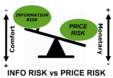
I selected something else because its bunch of things clamped together. I'm only interested in knowing if market is relatively weak or strong, I take position in that direction and try to maximize my chances.
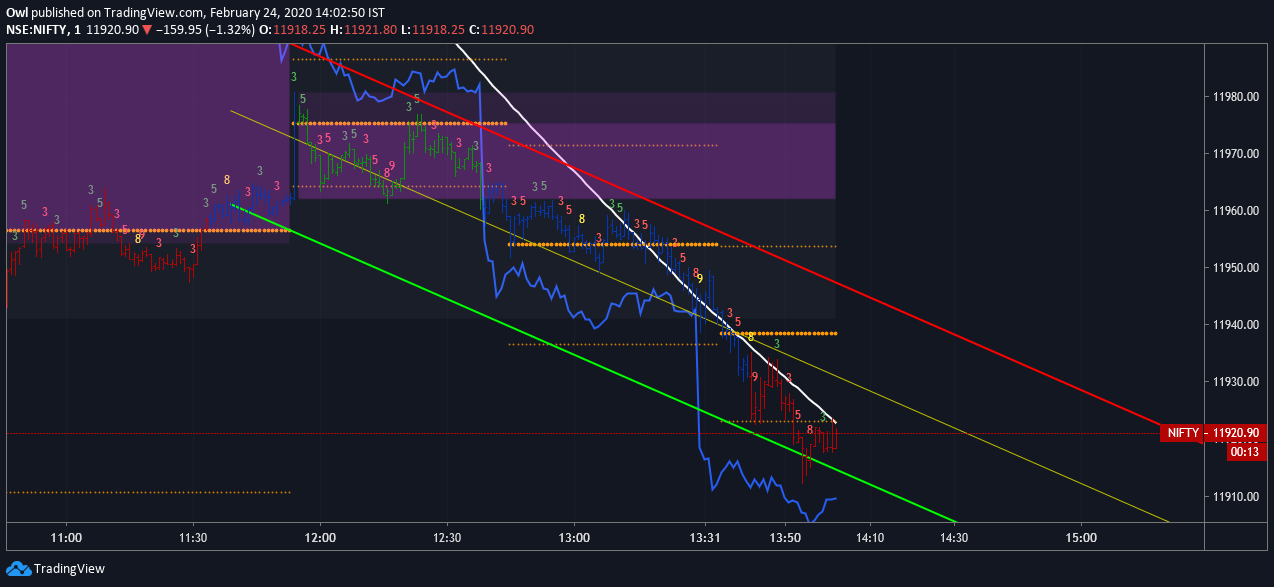
Here is chart I posted in some other thread today, markets were weak
And down below is the result
You can see the nice fall followed, this was globally weak session so I was bearish before market hrs but markets continued to be weak, especially after EU session.
If I had to pick one, it would be more in line with Context I guess.


 .
.