Welcome to NexusFi: the best trading community on the planet, with over 150,000 members Sign Up Now for Free
Genuine reviews from real traders, not fake reviews from stealth vendors
Quality education from leading professional traders
We are a friendly, helpful, and positive community
We do not tolerate rude behavior, trolling, or vendors advertising in posts
We are here to help, just let us know what you need
You'll need to register in order to view the content of the threads and start contributing to our community. It's free for basic access, or support us by becoming an Elite Member -- see if you qualify for a discount below.
-- Big Mike, Site Administrator
(If you already have an account, login at the top of the page)
To any and all who share an interest in Renko chart trading, I have, at the suggestion of several other forum members, created this thread.
I tried posting an annotated screenshot of the last 2 trading days (Fri 6/19 & today, 6/22/09), but for some reason, the upload never completed.
I'll try to post a screenshot after the creation of this thread.
I appreciate all feedback, as this has not yet been tested 'live', but shows great promise!
---------------
Explanation, as requested by BigMike:
I hope this is clear and easy to understand. If not, please reply and I will try to make it more clear. I have spent 2 years trying different indicators, settings, etc., (paper trading, every day, usually at a loss; thank goodness I did not have the courage to risk real money) and finally assembled this set of indicators that seem to show great promise.
These chart settings / indicators simulate what I have seen in webinars over the past 2 years, presented by other day-trading software vendors. It is my belief that we have all the tools we need to achieve the same results (or better!) than through the purchase of expensive software programs. This is not to say that there aren't excellent add-on products out there, just that I believe if we are truly committed to day-trading that we can achieve it through our own efforts. NinjaTrader is an excellent platform and 3rd party indicators / strategies are very easy to implement.
The basic concept is to identify Support & Resistance areas & trade between them. The difficult part is in identifying the difference between a trend change and a retracement, so as to not exit a long or short position before it is time to exit. I've heard many in webinars asking the difference between trend changes and retracements. Actually, ALL trend changes ARE retracements. They just retrace to the next support or resistance area, in reference to the time period being observed. The larger the time frame, the longer the period between major trend changes. (and the more 'retracements'). The shorter the time frame, the shorter the period between major trend changes. Although this is not the Holy Grail, it appears to provide fairly accurate reversal entry points for those of you who, like me, may have fallen in love with Ninja's Reverse Position button! I've long been a fan of J. Welles Wilder, Jr.'s indicators (Parabolic SAR, for one). It was his belief that we should always be in a position, either long or short. This attempts to provide an easy way of attaining that goal. I do not advocate, as he may have, that we stay in that position overnight. I feel it best (safest) at least for the novice trader, such as myself, to exit all positions before the end of the trading day. Another bus will always come along!
I use 2 charts. One is set to 6 tick RENKO bars and the other is set to 10 tick RENKO bars.
I think, in my original post, (in another thread) I indicated 8 tick & 10 tick. I have since changed the 8 tick Renko chart to a 6 tick Renko chart.
If your monitor is large enough, you can put one chart above and one below and change the bar spacing to make it easier to follow between the upper chart and lower chart. I also use Ninja on a laptop at home, which has a smaller screen. On the laptop, I put the 6 tick Renko chart on the left half of the screen and the 10 tick Renko chart on the right half of the screen, remembering to change the cursor setting in Ninja to GLOBAL, so that the cursor will 'track' the mouse movements on BOTH charts at the same time, which makes it easier to follow the price movement on both charts. Size the charts according to your personal preferences so that they 'track' and are easy to read and follow
I use the SMI2 indicator crosses on the 6 tick Renko chart & compare it to the SMI2 indicator lines on the 10 tick Renko chart for indications to enter a long or short position.
If there is a cross (above the red dotted line, and in a downward direction) on the 6 tick chart, I watch the 10 tick chart for a color change in the SMI2 indicator line & go short if it agrees in color and direction.
If there is a cross (below the green dotted line, and in an upward direction) on the 6 tick chart, I watch the 10 tick chart for a color change in the SMI2 indicator line & go long if it agrees in color and direction. If you want to be extra cautious wait until the cross on the 6 tick chart has occurred & the line has gone BELOW the red (upper) dotted line before going short & vice versa regarding a long position (green dotted line (below)). This seems to be safest, but again, nothing is guaranteed, and in waiting, you miss part of the move in price downward/upward and thus sacrifice some profit, but it is much safer! As in other areas of life, greater risk often results in greater reward and vice versa (but not always!).
Also watch for price to reach Swing High / Swing Low areas and INSIDE the 11 period Support Resistance indicator line. This usually indicates a price move to the opposite direction (at least to the higher resistance area / lower support area - sometimes only to the higher Dynamic SR 1 period resistance area / lower to the Dynamic SR 1 period support area). - See the screen shots for clearer example.
I use the HASH marks provided by the TSSuperTrend indicator, as places to put Protective Stops. If you are going to be trading with real money, make sure you change the setting in the NinjaTrader Chart-trader settings "Use Stop Market for Stop Loss Orders" = TRUE. That way, if price happens to increase / decrease to a point where you have set a stop, the stop will be instantly activated & your position will be exited at MARKET. If this is set to FALSE, the stop is treated as a STOP LIMIT order and MAY or MAY NOT get executed, thus leaving you in a potentially profit-losing situation. To change this setting, right-click on the Chart Trader panel at the right side of the Ninja chart.
To turn Chart Trader on, in order to change the Stop Limit setting to Stop Market, click the icon (4th from the right) at the top of any Ninja chart.
Pivot Points(Daily) - this gives you an idea of where price MAY pivot during the trading day, showing various support / resistance lines (R1,R2, R3 / S1, S2, S3 and THE pivot point (PP).
DynSR(1) - gives a little advance warning when price MAY reverse
Settings: Calculate on bar close? = "FALSE". Note: Make the Support & Resistance lines the same color - contrasting to the DynSR(11)
DynSR(11) - When price appears INSIDE the 11 period Support/Resistance, it USUALLY reverses direction down (or up) to the next support/resistance area.
Settings: Calculate on bar close? = FALSE" Note: Make the Support & Resistance lines the same color (greater thickness) - contrasting to the DynSR(1)
DynamicSRinColor(11) - it 'colors' the field between support & resistance - not necessary. Just downloaded this from Mikes Blogspot to see the effect. It is an interesting indicator, but I am not sure I will keep it on the chart.
Settings: Calculate on bar close? = "FALSE"
Swing(5) (not necessary, just like to see the Swing High/Low dots as a visual aid, but not neccesary) I use Cyan for Swing High & Magenta for Swing Low
Settings: Calculate on bar close? = "FALSE"
TSSuperTrend(ATR,14,1.25,HMA,14,Median) - I change the color bars from "BLUE" to "LIME" and leave "RED" as it is.
To me, Green says "UP" and Red says "DOWN", however, many people like BLUE as an indication of upward movement of price.
Settings: Show arrows? = "NO", Color Bars? = "YES", Calculate on bar close? = "FALSE"
PriceLineIndicator V2 (Solid,Color(Yellow),1) - So you can see a line indicating where the last High/Low Price of the Renko range was. Not necessary, just a visual aid.
Hope that helps in explaining the settings and all the crazy lines on the charts. I'll work on cleaning it up as time goes by so that only those indicators that are absolutely necessary are used.
Awesome, I have a lot to learn about Renko Bars and look forward to this thread. Nice charts, TheWizard.
This is the TradingStudies version of renko.cs file I had.
For newbies, you'll need to copy this cs file to your Documents\NinjaTrader 6.5\bin\Custom\Type directory, then exit and reload Ninja.
You'll also need to use the Format Data Series window to change to Renko bars.
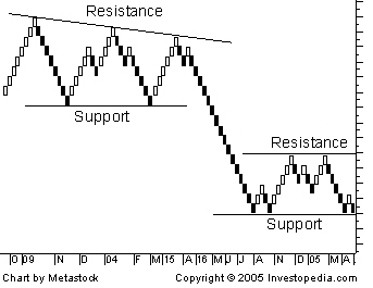
Here is a quick definition of Renko Charts, courtesy of Investopedia.
What Does Renko Chart Mean?
A type of chart, developed by the Japanese, that is only concerned with price movement; time and volume are not included. It is thought to be named for the Japanese word for bricks, "renga". A renko chart is constructed by placing a brick in the next column once the price surpasses the top or bottom of the previous brick by a predefined amount. White bricks are used when the direction of the trend is up, while black bricks are used when the trend is down. This type of chart is very effective for traders to identify key support/resistance levels. Transaction signals are generated when the direction of the trend changes and the bricks alternate colors.
Investopedia explains Renko Chart
For example, a trader will sell an underlying asset when a black brick is placed at the end of series of climbing white bricks. Since this type of chart was designed as a way to follow the general price trend of an asset, there can often be false signals where the color of the bricks changes too early, producing a whip-saw effect.
Renko is Renko, they do have valid whatever they have to have valid.
Please feel free to customize it whatever way you want.
Renko has a strong definition how they should behave, same as tick, time or volume based charts. It is everybody's preference which chart to use and how to use them.
Renko does not have high or low, because high or low is always equal to open or close (depending on trend direction)
Renko can not have any wicks or "display where the current price is"
I understand that you want to develop something new. And I admire and respect that.
My point is that we have to compare apples with apples.
Whatever newshoes or you have developed is GOOD and might have many advantages, however... it is not RENKO anymore.
Rjay, Thanks. Please advise when it's ready to go. I'm anxious to give it a try. After a day of loss yesterday, trading Renko, I abandoned it today & went back to Range Bars, applying BigMike's MurreyMath (amazing!), Sharky's ADXVMA and BigMike's %R with smoothing (also amazing) and had a good day! Range Bars seem to have less noise than minute charts, but not as quiet as Renko. Whatever you call it is fine. Looking forward to testing it out. Thanks!
looking good Jay, how about renko with HL.
ps just saw roonious' comment, first thanks for the tape channel indicator but I have to disagree with your renko comment its purpose is to keep you in trend and filter out the noise. from looking at the new renko i see it has the same purpose and more.